
 If you are like I am, you probably were not overly impressed with the abstract-looking Year of Mercy logo. I thought this kind of cubist-minimalist-inspired art was left in the 1970’s and 80’s, so what are we supposed to do with it in 2016? Well, as with pretty much everything in Holy Mother Church, she is wiser than I. Every item in the logo has a specific meaning, and, just as with stained glassed windows, icons, statuary, and the very church building itself, the Church uses all our senses to teach and guide us toward heaven.
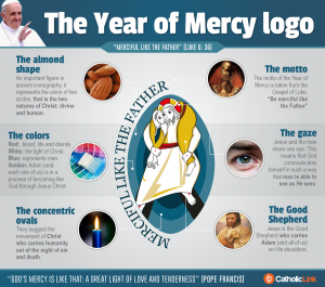
Here are the some of the meanings of each item in the logo (for more info go to Catholic Link by clicking on the image):
The Almond Shape: An important figure in ancient iconography. It represents to union of two circles representing the two natures of Christ: Divine and Human.
The Colors: Red: blood, life and divinity; White: the light of Christ; Blue: represents man; Golden: Adam and each one of us is in a process of becoming like God through Jesus Christ.
The Concentric Ovals: The suggest the movement of Crist who carries humanity out of the night of sin and death.
The Motto: The motto of the Year of Mercy is taken from the Gospel of Luke: “Be merciful like the Father.”
The Gaze: Jesus and the man share one eye. This means that God communicates himself in such a way that man is able to see as He sees
The Good Shepherd: Jesus is the Good Shepherd who carries Adam and all of us, on is shoulders.
For more details on the symbolism in the logo go here: https://catholic-link.org/2016/01/11/6-things-you-didnt-see-the-year-of-mercy-logo-explained/
As you are putting your finishing touches on your own Year of Mercy Badge Contest entry, take into account how your images could have meaning and instruct others on Christ and his mercy.
Download your official Year of Mercy Badge Contest application here.